
Thursday, 19 December 2013
Thursday, 12 December 2013
Actor Player Casting Agreement

This is the casting agreement we will give theese to each of our actors to sign.

Weather

Today is Thursday 12th December and we're filming our music video today, we have planned to meet our actors at 2 o'clock, we will already be prepared with props and equipment.A factor we needed to consider is weather, for our music video we wanted a warm autumnal feel but today it is cold and foggy, the whether may lighten up by the time we film but if not we will do some test shots and see how well this whether works still.
Wednesday, 11 December 2013
Tuesday, 10 December 2013

Sunday, 8 December 2013

Thursday, 5 December 2013
Location
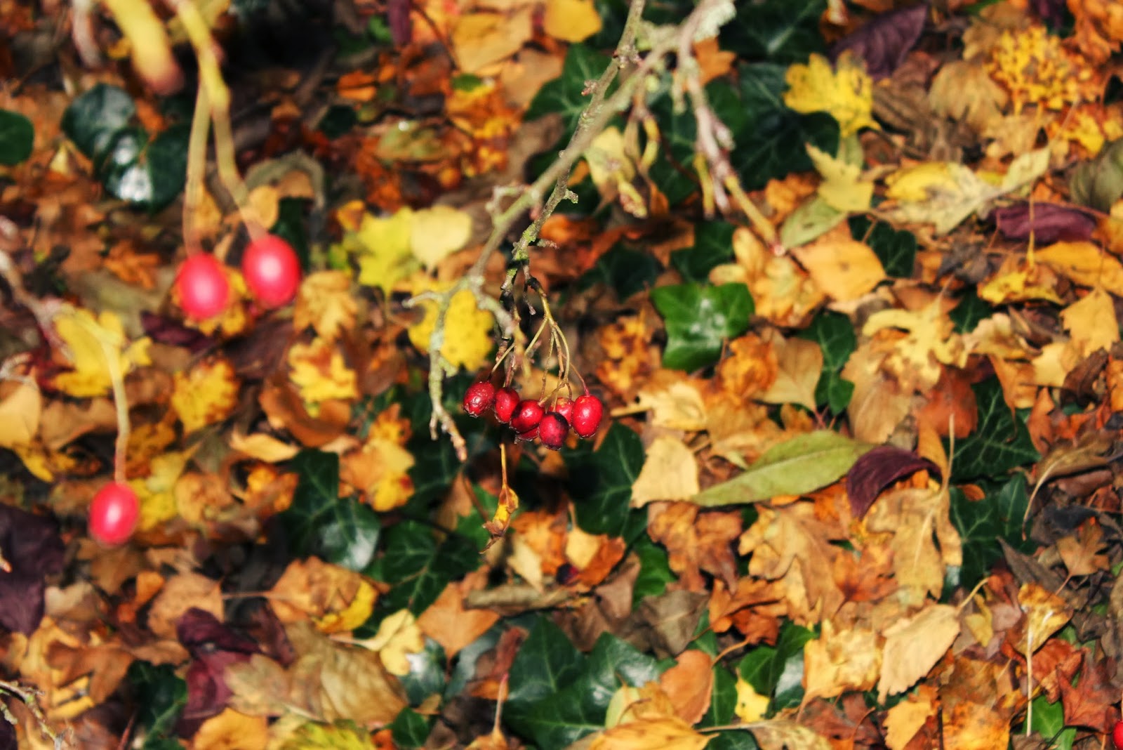
We went to our locations at 2-4, as you can see we start at Westmead avenue but when we shoot here it will not be this time of day we want it to be evening time, the next shots are of Medowgate lane I think at sunset time this works really well because it brings out the colours. Throughout the video we comment on what we think of the locations, at 3:10 pm we went to the another location which was a walk way which our music video will start in, the naturalness of this location works really well. We had planned to have this scene (opening scene) in medowgate woods but due to weather and it being over grown getting to the location was dangerous for us and the actors and it didnt get much sunlight so the colours of the leaves etc. couldnt be fully appreciated, so when we went to this location we found that it worked much better plus there was a small area with the walkway which was enclosed and had a fall tree which would work perfectly as somewhere for the couple to sit and chat and connect in the opening scenes. We will show this in our story board. As you see in the video the colours in the leaves and the berries are very vibrant and I think this will make the video look very warm which is what we want, it will reinfect the couples love and intimacy.
to be continued..
Four music video we are having 4 main locations. The first being an enclosed lane which has a lot of natural surroundings and slightly up the road is an open field that would be ideal for the establishing shot.

This image could be used for the shot that will show a delicate part of nature such as leaves or flowers, because of the time of year leaves are easier to find. The lyrics at this point will be "from killing all that's delicate".


This spot is what will be used for the opening scene, it is enclosed and covered by trees, there is a fallen tree that the actors can sit on it will make the scene cosy and intimate.


This is the log that the actors will sit on in the opening scene.

The leaves in this area are a vary of colours which makes it very warm, also their are berries which add alot more colour.


This shot could be a shot that is used between shots as they move from one location to another.


This image would be ideal for the establishing shot, it is very warm and would set the scene.


This would also be a good shot for the opening scene.
The second location is Medowgate road, this links the begging location to westmead avenue.

This shot will be evening time between 3-5, we want the sun to be out so we can capture the warmth this is the


This location is one we really liked but too make the locations flow we would've had to start with this location and we had already planned and agreed on how we wanted it to start so that wasn't an option, this would've been our choice instead of medowgate lane but we wouldn't have been able to make it flow as naturally and it would've looked choppy.
The third location is westmead avenue, at this point it will be almost dark and the artificial light gives a very warm effect down the road.

This shot is to early in the day and doesn't work as well.

Theese are stills from when I did some filming practicing, the lighting works much better at this time of day, the shots look warm and alot better than with natural daylight.


Health & Safety, Risk Assessment, Concerns Discussion

These were just a few notes I took throughout our discussion.
Tuesday, 3 December 2013
Crew List
Crew List
Alysia
Hurrell (me)
- Director, Producer, Cinematographer, Camera Man, Editor
Sarah Edwards
-
Director, Producer, Cinematographer, Camera Man, Editor
Kobey Taylor - Male Actor
Chelsey Gibson -
Female Actress
There has been a change in line of
for the actors; the male actor will be played by Luke Leeks instead of Kobey
Taylor.


Sunday, 1 December 2013
Digipak & Magazine Research
Tom Odell
 This is the magazine advert for Tom Odells 'Long Way Down' album advertisement. I really like this layout because it is eye catching but not over powering, this is a style I will definitely consider. I also think it works well that the album cover and magazine advertisement is the same image it will make the album more recognisable. This cover has a very rustic feel and shows Tom Odell as a very laid back natural artist, I think using the same colour scheme for the fonts as the image work really well. There is a clear colour theme and this makes it look proffesional. The quotes and ratings make it seem legitimate. I think it is good that there is little information, this makes it less fussy and more eye catching, the association with the brit awards make it seem very popular and It gives a dramtic feel to have the debate in a large font in the corner, it does not say that this is the date it will be released but it is evident.


This is the mock up design in the style of Tom Odells album that I started on Photoshop, I found Photoshop very hard to use and it is something I will have to practice. Something that was stopping me from completing the mock up was resizing the image, even when doing what is necessary to change the size of the image and still keep it in focus because of the quality of the photo I couldn't get it too be high quality. It took me around an hour to get to this level on photoshop and it is incomplete and out of focus.


This is the logo that is on Tom Odells Long Way Down album magazine advertisement, I think this adds authenticity to the album, I tried to recreate it on Photoshop but as you can see I didn't have the same result I am going to practice using Photoshop so I can get the professional feel I want.


This a version based on a few ideas taken from the Tom Odell album. I created this on photoshop, it took me around an hour, what took longest was editing the brit award logo and the stars because they are small. The central image is one I have taken myself, I have edited to make it warmer and added a lense flair. The image looks really soft and I think this relfects the artist well, he doesnt look intimdating or to commerical, just appraocable. It took me longer to do the brit logo but it worked out alot more porffesional looking than before. I like the navy writing this goes well with the theme but I'm not sure about peach for the other font.

This si the same version I did but I changed the font to white because I asked my peers and one of there changes would be changing the font to white. Another change I need to make is that some of writing needs to be moved so it can be seen more clearly and then making it look more proffesional.


Ben Howard


 This is the album cover and magazine advert for Ben Howards 'Every Kingdom' album. I really like this album cover, I think it is really interesting and eye catching. I think the range of colours between blue and white work really well, the font is bold and draws your eye in, I think the theme of water shows that this album is relaxed and natural. I recreated using my own image and artist name on Microsoft Word. I really like the outcome but I don't know if the image used needs to be a bit more eye-catching, as you can see in the Ben Howard album cover the sun shining through the water has a really nice effect so maybe I could try and recreate this in my own image.

This image is in the style of the Ben Howard album but I have change the font. I quite like this font, it isn't too heavy and draws the eye to the image but I think that the artist should be featured atleast somewhere on the front image so it becomes more recogniseable. Below I have changed the font, I dont like this font it doesnt have much character and is to plain for my artist.


This is a design


Lewis Watson

 This is the album cover for Lewis Watsons 'The Wild'. I really like how natural this digipak cover is, the artist looks very relaxed and natural and the scenery works well it is quite dreary but the light from behind the trees makes it look positive still. All the actor has is his guitar and it gives the impression that it is just him and his guitar and that wherever he goes as long as he has music it we'll be okay. I recreated the style of his digipak cover. The font is 'Brain Flower' I think it looks quirky but it also seem quite child like I don't know if it reflects the artists well enough. The image used is of one of the locations in he 'Stay Awhile' music video, I think the colours of the trees look really good but the light on the road looks very bright and unnatural, I think for the image to work I would have to make it look warmer.

This is a magazine cover I have recreated inspired by the ratings, descriptions and image style of Tom Odell and the font of Lewis Watsons. I don't think the image works well because the actor isn't looking in the camera and also I don't think he colours in the image are warm enough. I also don't think I works having all the fon the same colour has nothing stands out individually. Something else I would change is this font style for the small writing it doesn't stand out enough.
Mumford & Sons

 These are the albums for Mumford & Sons 'Babel' and 'Sigh No More'. The 'Babel' cover is very natural and I like that they are all in focus, they're also all on the same level and are of equal size, this shows that they are equal as a band. It is very colourful and eye catching, I think the folksy laid back theme makes them recognisable as Mumford & Sons. The 'Sigh No More' album the colours of this Digipak are calm and neutral colours; this reflects the band’s music style of being relaxed, folk and non-commercial music. The cover is of the band standing in a shop window, they are dressed and standing casually this reflects their laid back style and the presence of instruments show that this is mostly how their music is made, just their voices and instruments, they’re not computerised. The font is traditional and simple but with flair, which again reflects their style of music.The back cover is a picture of a window, this would be the back of the shop window, this works well because of front of the shop being on the cover. The layout of the back cover is very simplistic; they give the impression that they are a very independent, pure, small town band. Nothing about the designs are very loud, the band rely on their own talent and what the audience would look for in them, just something simple yet beautiful that reflects their style as a band.
This is a font that has been used for Mumford & Sons, I have used my artists name with this style, I really like the result. I think it is very rustic and not childish.
This is another style of font from Mumford & Sons albums, I also like this style, I think it would stand out well and I will have to do some tests with the images I have taken, a problem I may have is getting the fonts, some have a price so I will have to do some research.

Digipak Layout
This layout plan is one I found on the internet it isn't very detailed but I think I shows a good basic outline.

This is the digipak for Katy Perry, this layout is what I will be using for my digipak.

I have done a basic design below. The top panels are shown from the back and the ones below are inside.

Here is a mock design I did with my own images to show how it could look the front cover and inside right image are both of the actor, the back image is of the actor walking away and the inside images feature alot of nature. I really like this by showing that the artist is in touch with nature makes him seem more genuine and
then more likeable.
then more likeable.


Generic Marking Criteria from OCR:
In Media Studies, the quality of
written communication will be taken into account in assessing your work in the
two externally assessed units.
Candidates will:
• ensure that text is legible and
that spelling, punctuation and grammar are accurate so that meaning is clear;
• select and use a form and style
of writing appropriate to purpose and to complex subject matter;
• organise information clearly
and coherently, using specialist vocabulary when appropriate.
Print Level 4 48–60 marks
There is evidence of excellence in the
creative use of most of the following technical skills:
• Producing material appropriate for the target audience and task;
• showing understanding of conventions of layout and page
design;
• showing awareness of the need for variety in fonts and text size;
• accurately using language and register;
• using ICT appropriately for the task set;
• appropriatelyintegrating illustration and text;
• shooting a variety of material appropriate to the task set;
• manipulating photographs as appropriate to the context for presentation, including cropping and
resizing.
Subscribe to:
Comments (Atom)